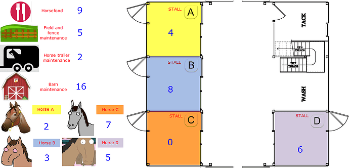
(Brainfart coming) - going BIG (chess board coordinates for SYS) - as intranet frontpage

  • First some intro / rambling about - and WARNING - this might be kinda fringe - and maybe a little bit to bounce off:

    • I’m probably affected by pop-culture’s simplified interpretation from TV-shows, but I’ve always wondered about the “unsung heroes” that coordinated information and logistics for let’s say the Manhatten project or the Chernobyl cleanup. NASA and the race for the moon is on the list as well.
      • There probably were some pretty bad-ass organizers around, with ideas, systems, “stayer attitude” and the ability to push through and gain traction with implementing it to a lot of people.

      • Those people should be (more) celebrated? I wish there was literature focusing on “how did they do it?”.

      • Anyone know of literature / some good reads about past heroic feats of organizing people and information?

    • I read an article a while back (couldn’t manage to find the link in a jiffy, sorry). The content was rooted in a discussion about UI/UX and content strategy - emphasizing that companies that go for TEXT ONLY content (let’s say markdown, or similar) have a higher chance of keeping/maintaining the value of their (internal) created content in the long run - than companies that focus more on how the information looks and care more about being “cutting edge” for UX and UI.
    • There is a big difference between companies that have a clear content strategy (including maintenance, and when to un-publish information) - and companies that treat the actual content more as an afterthought. With today’s pace and changes to information “ecosystems”, having information being able to survive (time/continuity) is somewhat of a challenge.
  • Alright, so where am I going with this?

  • Let’s pretend that someone was starting a company.

  • The company grows, and has the potential to become big.

  • A lot of people get involved.

  • Decisions need to be made, and the dynamics are such that things can no longer stay on the hands of a few people.

  • You get the randomsness of people, ideas, chemistry, chaos, coincidence, human nature and all the other good stuff that comes with the territory.

  • If I was to run this company, I would INSIST | DEMAND | FORCE the idea of keeping information structures as basic as possible.

What would it look like?

  • Enter the chessboard - and the JD system.

  • Sure - one would need to find a way to make it more visually compact and appealing.
  • But for many people, all their workstuff/spaces would reside/exist in system e7 - or h1 - and most people might stay in their system/realm.
  • But ALL of the information - on a top level - is available. And easy to reference.
  • This way of presenting would be the top level and the “homepage” of the company intranet.
  • In your face, every time you open it.
  • Always the same.
  • No company (however big) should ever need 64 “squares” = JD systems.
  • Say 00-09 was reserved for “system” - along with all of the *0, leaving 9 * 9 * 99 * 64 = 513 216?
  • So of course it is possible to scale it a bit down (less “squares”)
  • It would be consistent.
  • It would be easy to make and maintain a simple .html page - where each area was a link to where the information actually is.
  • It would probably survive, even with web and information technology changing.

:exploding_head: Whooaaaaa… keep going. I like this.

Too busy to give this much thought now but I’ll 100% be back here next week.

I really like this.
I am a strong believer in the primacy of visual/spatial thinking. It might be my geography background.
But at the same time, I think you are right to point out that keeping the visual interface to the minimum avoids wasting energy that should go into the work itself. A simple graphical layout like this is sufficient to trigger all our spatial recognition brain routines.

I for one get lost in text-only, markdown-in-the-terminal;
when I’m composing a larger text, I need to put it into something that looks more like a page in the real world; even just a live html preview window does it for me.

But a little is all you need.

Of course, you can also use the grid as you zoom in, i.e. you can create a grid of your single system’s areas and IDs.

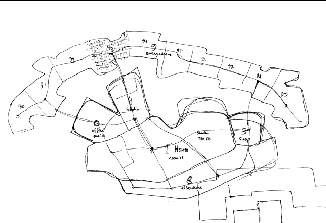
I just thought I’d share what I was up to last week, since it’s on the same theme: I made a ‘map’ of my areas which is loosely based on the actual topology of my house, garden, shop, etc, then modified the shapes a bit to make a memorable map. The idea is that this could be a main ‘frontpage’ interface to the system, on some kind of zoomable map interface (either a real slippy map, or just a graphic that you can click through. Categories and IDs would be polygons or points distributed inside the areas).

bitmap

I don’t, sorry (would love to read that), but I’ve noticed a hint of past organisation systems. Technical manuals like Haynes Repair and Workshop Manuals and Zinn & the Art of Road Bike Maintenance don’t use chapters and page numbers, but section numbers for cross-referencing. It’s super annoying at first, but where there’s a pattern there’s a purpose and I’ve always wondered if this is a relic of a much more extensive set of ‘best practises’ for organising technical documentation in the paper age.

There might be a few brainfarts left actually. Finding a bunch of nerds :raised_hands: :raised_hands: talking about organizing information on the internet has obviously stirred some things.

Going travelling for a bit, I’ll let them stew. I believe next topics in the “brainfart series” might be (standard choice) of colors for markup (stolen/copied from someone else, much wiser than I am) - and perhaps one on simple yet practical tools for construction site administration.

I am as well. I believe (and respect, try to adjust to the fact) that people navigate information differently - some are more inclined to certain ways than other - but visual/spatial is dominant for me in terms of recollection/memory.

I like your map.
I get it.

I once did a feature request for a Kanban tool (Kanboard) hoping to gain possibility of adding visual /spacial layer to tracking tasks (mapped) out to objects, but I think I overcomplicated it. (Didn’t catch on with the community or the (solo) developer.)

Illustration ( :crazy_face:)

I think I have some around somewhere (for old cars that are long dead)… I’ll check it out. Tnx.

The map stuff is interesting. One of the things we’ve done for the quick start pack we’re putting together is a two-page spread that shows the categories and subheaders just laid out. I wanted you to be able to just picture roughly where in your system a thing – say, pets – was.

Oh, you’ll think, it’s about half way up category 12. And hopefully that’ll be easier to remember.

I’m also the sort of person who needs the preview window to make a markdown document feel ‘real’. Curious.

@fender what you describe in that feature request at Kanboard is exactly what I envision for my system map, in combination with task management tags.

I think a simple grid would work well, too. It might work well to be able to switch back and forth between a grid view, and a ‘custom map’ view, depending on the document format and the task at hand.