22.00.0075: Increase contrast

A couple of weeks I had a Zoom chat with Decimal @Jayde20,[1] and noticed that her screen looked really really cool. What’s that?, I asked her.

It was macOS’ increase contrast accessibility mode, and it’s changed my life.

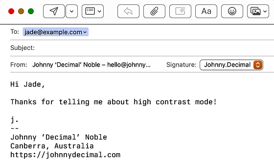
Here’s how a modern mail window looks.


FIGURE 22.00.0075A. THAT’S NOT A BUTTON…

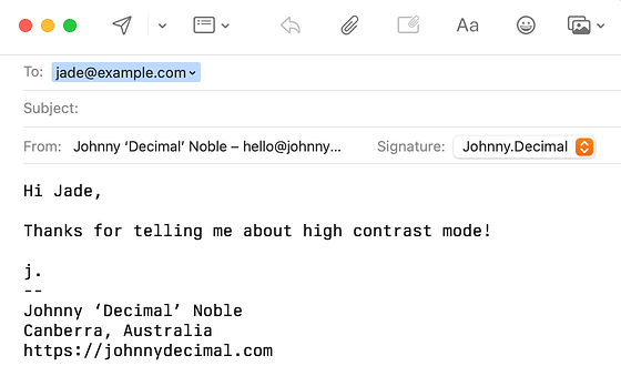
And here’s how it looks with increased contrast. (And Berkeley Mono set as the display font.)


FIGURE 22.00.0075B. …THAT’S A BUTTON!

This difference is startling to my eyes and it’s changing how I use my computer.

I use windows – lowercase – heavily, as in I have lots of overlapping windows open. As well as making each individual app easier to use, it makes my entire desktop more cohesive.

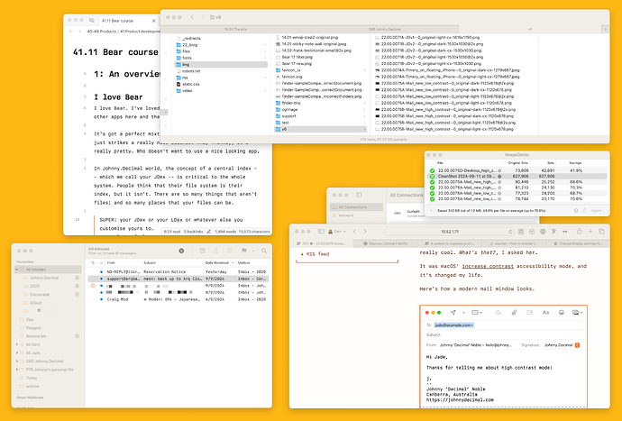
Here’s the before. (Full size light, dark.)


FIGURE 22.00.0075C. LOW-CONTRAST DESKTOP.

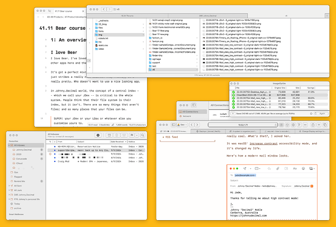
And after. (Full size light, dark.)


FIGURE 22.00.0075D. HIGH-CONTRAST DESKTOP.

To my eyes we’ve gone from a kinda-pleasing-I-guess? smush of windows to a version where everything pops. Windows have an identity now. You might not find it as visually pleasing, but functionally it’s night and day.

And, after running it for a few weeks, I do find it more aesthetically pleasing. What made us so afraid of a border around an icon? (A: Jony Ive.)

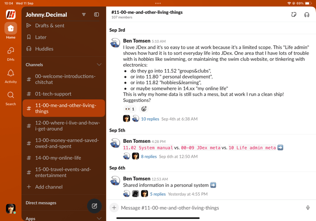
Modern apps have embraced this squishy-edge mentality, to their detriment. Here’s Slack on my iPad. Honestly I look at that and I’ve no idea what I’m meant to do. I hate it.
Screenshot of Slack. Meh.
FIGURE 22.00.0075E. SLACK ON IPAD. A BIG MEH SANDWICH.

There are whole threads of information hidden behind 8-point blue text. It’s ridiculously un-discoverable.

Try it

Give this a go for a couple of days. It’s a single toggle in your system’s SettingsAccessibilityDisplayIncrease contrast.

I don’t think I’ll ever go back.


  1. Friends-of-the-system are bestowed with the honorific ‘Decimal’. ↩︎
It was somewhat obvious to me when I opened up accessibility, but in case others are wondering, there is an additional level:

SettingsAccessibilityDisplayIncrease contrast

As for my opinion, I really like this contrast in light mode, but in Dark mode… I actually can’t stand it :laughing:

Ah good pickup, I’ll edit the post!

And this yet again shows that I don’t use dark mode. It can’t be that bad is it?!

I quite like it in dark mode, as well. But then, I try my level best to never run in light mode, so… good thing we all have options!

Just have to make sure that, if you’re sharing UI related screenshots, you have another device or account running without Increase Contrast enabled, to avoid sending the rest of your team into a panic.

1 Like

Wow — thanks for the tip. I may even try out dark mode (I’ve refrained from it with the defaults)

Glad I could be of service lol!

Bright contrast is really useful when your 5 year old hides your reading glasses and you have to wear your prescription sunglasses instead :rofl: … the darker contrast is also really helpful if you want to hide and play on your phone under the duvet whilst trying to get said 5 year old to go to sleep :rofl: … not that I’d know anything about that though :rofl::sob:

1 Like

Dark mode is weird. Some people swear by it; can’t use anything else. Some people like it when it’s dark. Some people — me — can’t stand it. Ever!

My eyes just can’t read white on black. I’d much rather read black on white, but dim.

It looks cool though…

I prefer bright black on white mode too!

Not to surprise anyone, on MS Windows, high contrast is ugly as f*ck and borkes the UI of all 3rd party programs :rofl:

Spoiler

Dont worry, i’m on linux and here is more manageable, sometimes is on by default, and is better integrated with 3rd party apps

Yeah I tried it in my virtual … hoo boy. That is uuuuu-gly.

I am Jack’s complete lack of surprise.

1 Like

Oh btw, I love Decimal Jade, that is a great honour :smiley:

1 Like